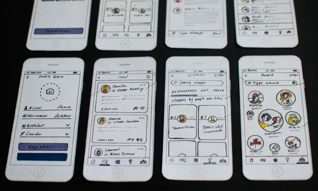

Challenge
Vleepo is a new messaging platform that is redefining what group chat should be. When I just started to work on this project the biggest issues were browsing experience, complicated Home screen, unclear icons, chat structure, and typographic hierarchy. There were many screens to redesign and a lot of work to do.
Solution
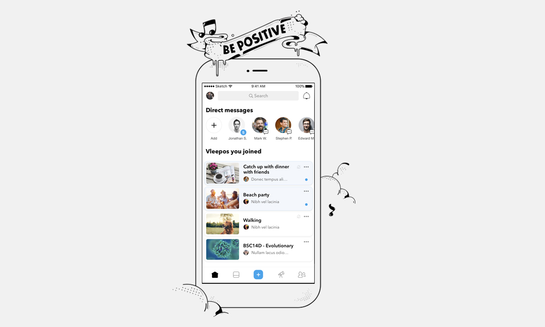
Most screens were reorganized and simplified. I added DM requests, created different categories of notifications, highlighted unread group chats, and changed messaging flow. I also created a map interface that helps to discover relevant vleepos based on user’s interests and location. All icons were redesigned and received positive feedback from users.
Another step was onboarding flow rethinking. I noticed that almost 30% of new users quit registration process. To solve this problem I decided to reduce the number of registration steps and add illustrations that help to understand the main features of the app.
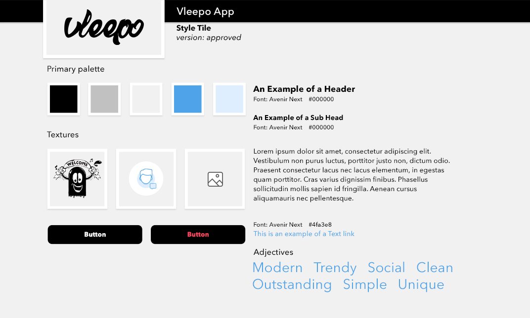
I also created a style guide and build a system of typography hierarchy.
