Challenge
My client just started her business and asked me to create a corporate identity for handmade custom accessories Sakura Kiss and design a recognizable character for brand storytelling.
Solution
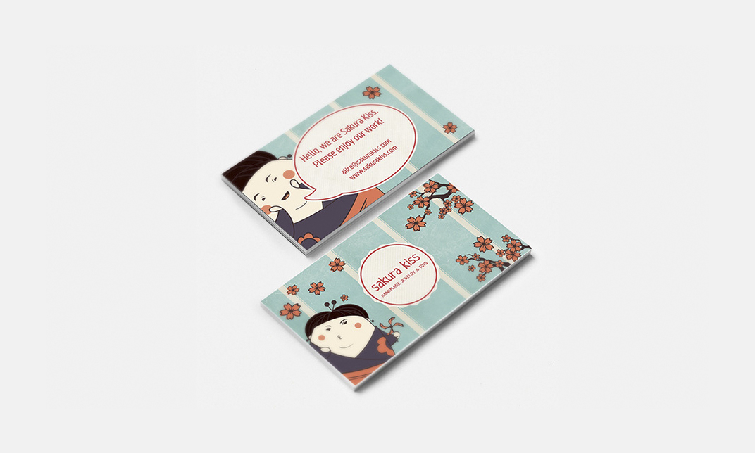
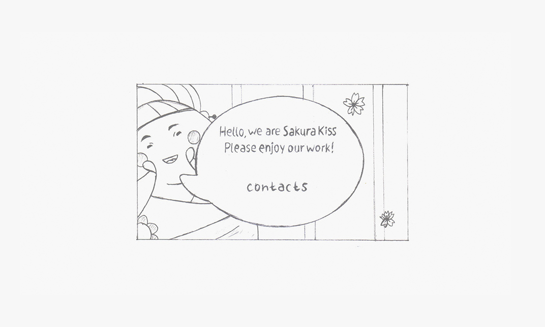
Sakura Kiss logo, character and business cards represent brand core values such as inspiration, youthfulness, bright imagination, and joy.
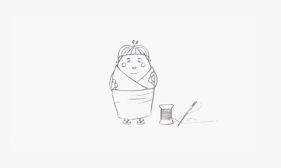
I developed four versions of the logotype using different handwriting and sewing accessories.
Neucha font was picked to give the final logo playful look and feel, and the red color was used to make it stand out. Graphic element symbolizes embroidery frame with stitched wordmark and descriptor.
As the brand is more youth oriented I decided to create a joyful character that wears traditional Japanese kimono (a reference to the brand name), and tells different stories to customers. With each purchase a customer receives small comic book and can vote what new amazing adventure Sakura will have next time.
The character was executed in chibi style. Chibi (-小人 or ちび) is a Japanese slang word meaning "small person".
For the final result I used a retro color palette.
The client was thrilled with the printed glossy business cards, and also invited me to work on their website.
